Once upon a time, cell phones were just phones, and home buyers were restricted to researching a purchase from a desk, either at home or work. If a buyer was interested in a builder, she may print out floor plans and maps, or even call the sales center to ask questions.
As the phones in our pockets have evolved, your buyers now have the freedom to shop and research anywhere from her favorite coffee shop, to the line at the grocery store, to the backseat of an Uber. With this freedom comes new expectations for websites to be smarter, faster and easier to use.
You’ve likely heard of a popular solution to this problem called responsive design. It refers to the process of creating a website that adapts from a full version in larger desktop browsers to a more simplified version for mobile phones and tablets.
Previously, the majority of websites had been designed with the desktop user in mind, created to be “all things to all users” and then, often times towards the end of the design process, or even after launch, a mobile version was created to strip away non-essential features, simplifying the site for mobile users. These buyers not only have smaller screens, they are often seeking out specific, different content than desktop users.
Enter mobile-first: the new way to design responsively

The mobile-first approach to home builder website design flips the previous method on its head, in exactly the way it sounds: designing for the smallest screen and working your way up. Start prioritizing the needs of mobile users by placing the content they are looking for in the most accessible place. What, in a given situation and a given environment, will your user appreciate most?
Consider this experience: you’re driving to visit a builder for the first time, with spotty service. The model home you’re driving to is often on roads that aren’t even on Google maps yet. You may have to click through and wait for 3 to 5 pages to load before you get to the page with the directions you need. After that frustrating experience, you’re probably not in the best frame of mind. At best, you’re not excited to explore a model and open up to the sales team. You may have a negative opinion of this builder because of your struggle to find them, or worse, you may abandon this builder and go to one that’s easier to find.
Four ways you can get started with mobile-first right now
 1. Become the user
Visiting your company’s website on your phone and running through some common mobile user paths will help you quickly identify pain points on your site for usability testing. Here are some example user paths to try, extra points if you turn your wifi off and see how long the pages take to load.
- Like the above scenario, get directions to a model home
- Pretend you’re lost, and find a number to call
- Check out a page for a floorplan or inventory home, envisioning your spouse shared the page with you via email or text
2. Make navigation easy
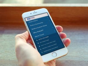
Once you’ve determined what mobile users are looking for on your site, make it easier for them to get there. Add a sticky button to get to locations or directions, or link it in the main menu. Help is only a click away: make phone numbers or click to call buttons prominent and easy to find.
3. Design for thumbs

The bigger the device, the harder it is for users to reach content at the outer edges of the screen. Keep this in mind when you’re designing. Remember to give enough space so that users aren’t accidentally clicking the wrong thing. Many sites have moved their navigation to the bottom—a place that’s easier for users to reach.
4. Remember: Users won’t mind extra clicks as long as they’re meaningful.
Does your CRM require a detailed amount of information to keep track of a lead? Breaking up forms into individual pages helps users focus on what they need to do. Fill in forms for your users wherever you can, based on info they entered into previous forms.
Keep in mind the important thing for your for customers is to be able to quickly and easily find the information they’re searching for—and perform the actions they’ve set out to do. Just like every part of your customer’s journey, the goal with your website should always be to consider the customer first. By adopting this mindset, you’re already on your way to creating an unforgettable home buying experience.
Find out more
To learn more about how Bokka's home builder marketing services can help you improve your home buying experience, get in touch today.


